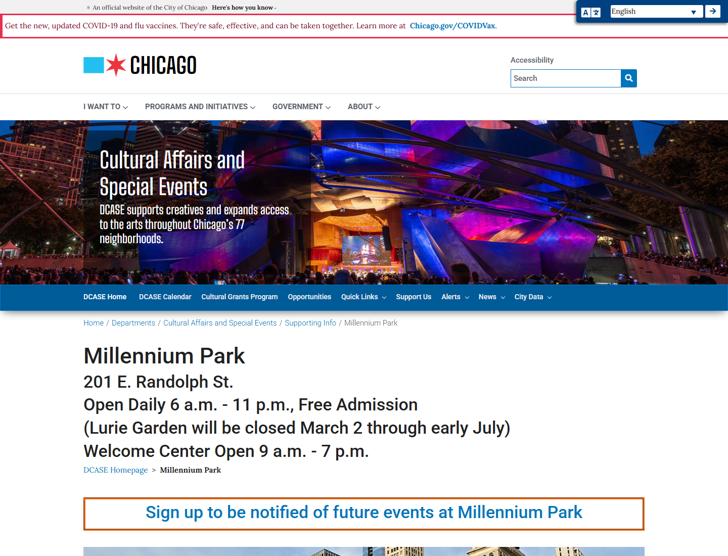
Current page signal
The existing page has official information, but the first screen can make core visitor actions harder to scan: hours, events, maps, accessibility, and what to do today.
Pimp My Ride experiment, but for websites
Starting link entered for the demo: Millennium Park. Ten Thirty Two only touches the first-page concept here: clearer visitor actions, calmer hierarchy, faster scan paths, and a mobile-friendly destination layout.
Before versus direction
This is not a full city-site replacement. It is a first-page concept showing how a visitor page could lead with practical visitor needs instead of making people hunt.
The existing page has official information, but the first screen can make core visitor actions harder to scan: hours, events, maps, accessibility, and what to do today.
Chicago public destination
Find today's hours, events, entrances, accessibility notes, transit, dining, and must-see spots without digging through department language.
What Ten Thirty Two would change first
Lead with what visitors need now: hours, events, map, accessibility, and transit.
Use consistent cards, short section labels, and links that say exactly where they go.
Most visitors are likely standing downtown with one hand on a phone. The page should stack cleanly and keep tap targets big.
Demo boundary
Ten Thirty Two is using the submitted public URL as a design exercise. The before screenshot is shown for critique context. The after side is a static first-page concept demonstrating clearer information architecture, visual hierarchy, and conversion paths.